Padel Club — Final Brand Directions
Padel Club
Final Brand Directions
Rogue · Vale · Highline — three naming directions, presented side by side.
What we will walk through.
A shared visual foundation.
The agreed foundation shared by all three naming routes: colour, stripes, typography and photographic character.
Main colours
Dark green
The primary visual anchor.
Working value — to be confirmed
Light neutrals
Breathing space.
Working value — to be confirmed
Support colours
Deep terracotta
A warm, earthy accent, used sparingly.
Working value — to be confirmed
Navy
Supporting depth and contrast.
Working value — to be confirmed
Working values shown for layout only — final colour values come from the supplied palette. Swatch sizes show the intended hierarchy of main and support colours, not an exact usage ratio.
Palette reference: The supplied palette sheet. Working values below are placeholders until confirmed.
Naming route
Rogue Padel Club
A confident, independent name with a playful edge, balanced by a refined club identity.
Creative positioning — for discussion.
One naming family, three visual treatments — Option 01, Option 02 and Rógue / Option 03 — presented in turn below.
Naming considerations.
Context before the designs: the appeal of the name, and the practical points to weigh alongside it.
- Rogue is an existing English word used by other businesses, which may affect distinctiveness and search visibility.
- Existing sporting or lifestyle uses of the word may need closer review.
- Domains, social handles and consistent use of “Padel Club” need to be assessed.
- Any specific conflicts, businesses or rights would need to come from supplied evidence — none are assumed here, and no clearance search has been completed.
Current project view — to be confirmed against the trademark advice
“The project team's current view is that appropriate EU trade mark protection could provide a sufficiently strong basis to proceed with Rogue Padel Club and protect its use for the club's relevant activities. That view remains subject to confirming the specific mark, goods and services, application or registration status, and any earlier rights.”
Supporting notes
If confirmed professional advice or registration details are supplied, this wording will be replaced with an accurate summary of that evidence. An application is not a registration; no worldwide ownership is implied; and a trademark does not guarantee exclusive control of every use of the word Rogue.
Option 01.
The script identity.
COCA Studio · Script Logo V4 · Revised 29 September 2026 — View original draftA contemporary copperplate.
For the Rogue logo, I’ve used PP Playground by Pangram Pangram instead of a generic script.
It’s a contemporary take on copperplate — elegant, but with sharper edges and unexpected details that stop it feeling off-the-shelf.
The capital R has been updated to remove the lines and soften it.
The monogram
The club in use
Campaign & club communications
These are supplied draft concepts, with the original copy preserved. Different opening dates, locations and event details appear across the mockups; none should be read as confirmed launch information or club policies.
Option 02.
An alternative presentation of the same identity. What changes, and the effect that has, will be described from the supplied design.
Direct comparison — matched canvas
Option 01
Option 02
Rógue — an Irish reference.
A creative variation on Rogue, referencing “rógaire”, an Irish word for a rogue or rascal. The accent introduces a subtle Irish connection within the proposed identity.
Rógue is a coined brand treatment, not the Irish translation of Rogue, and it does not by itself change the trademark position.
Practical considerations
- Consistent use of the accent in artwork, signage and written communications.
- Recognition and pronunciation to be considered with the client.
- A clear unaccented fallback for URLs, handles and systems that require it.
- Review of accented and unaccented forms as part of the naming and trademark work.
Three treatments, one family.
Option 01
Option 02
Rógue / Option 03
04 — Naming route
Vale Padel Club
A slightly retro, preppy identity with a relaxed take on the American country club: considered, easy-going and aspirational, with a sense of belonging.
Where we want to sit.
Proposed positioning from the supplied draft — not a confirmed membership or facilities offer.
The map shows the range of places people can play padel across Dublin, from dedicated padel clubs to tennis and fitness clubs with courts. These are all part of the competition, so we need to be clear about what would make someone choose us and keep coming back.
My feeling is that we want to sit above the ‘pay per play’ market, where people go onto a booking app and choose whichever court is available or cheapest. We want people to become members, feel part of the club and be loyal to it. Somewhere they enjoy spending time, meet people and stay for a coffee after a game.
That also means we are competing with clubs like Fitzwilliam, Elm Park and David Lloyd for people’s membership spend and free time. The quality of the courts matters, but so does everything around them: the welcome, the surroundings, the social side and how the brand makes people feel.
I think the opportunity is to create an aspirational club that still feels relaxed and welcoming. Somewhere people are proud to say they belong. The name and identity need to support that from the outset.
Look & feel
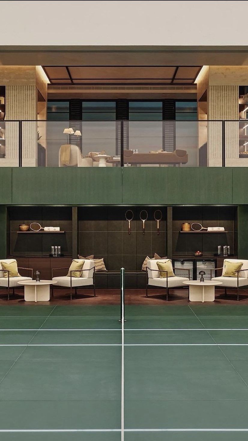
We are staying close to our original direction: slightly retro and preppy, with a relaxed take on the American country club feel. There is a sense of tradition and quality, but with enough personality to keep it fresh and stop it feeling too serious.
The greens and creams, vintage sportswear, caps and collegiate details all help create that feeling. The references mix classic club styling with a more casual, everyday look — clothes you would want to wear beyond the court, which is how I would like the Vale brand to work too.
The aim is for everything to feel considered but easy-going. A club with its own style, where you can enjoy a good game and feel just as comfortable hanging around afterwards. Aspirational, but somewhere you can see yourself belonging.
Why Vale Padel Club.
Vale feels like a good fit for this positioning. It is short, easy to remember and has a quietly established feel. It sounds like a club you could already know, while giving us room to build our own character around it.
The word means ‘valley’, which brings associations of greenery, space and a little escape from the everyday. There is something in that which suits the kind of club we want to create: a place to play, switch off and spend time.
‘Padel Club’ makes the offer clear, while ‘Vale’ gives it an identity of its own. It also works naturally in conversation: ‘I’m playing at Vale’ or ‘I’ve joined Vale’, which is how we would want members to talk about it.
Vale also gives the club room to grow. If the offer expands into other areas over time, the name can comfortably carry that. Padel is the starting point, but Vale can become the name people associate with the whole club experience.
Naming & availability checks
The supplied September draft reports that valepadel.com/.ie and valepadelclub.com/.ie appeared available during initial checks. This is historical draft information, not a current availability check. Similar names exist in the wider market; final domain, social handle and trademark checks remain to be completed. No clearance is implied.
Current project view — to be confirmed against the trademark advice.
The logo & monogram.
The logo
The logo brings together two sides of the club: a clean, confident VALE wordmark and a more relaxed, flowing ‘Padel Club’ underneath. That combination picks up on the slightly retro, preppy direction, while still feeling fresh.
The details in the VALE lettering — the angled edges, varying line weights and shorter middle bar on the E — give it its own character.
The script adds some softness and a nod to traditional club lettering. Together, they create a balance between feeling established and keeping things easy-going.
The monogram
The monogram takes the strong V from the main logo and weaves the P and C through it in script. It carries the same mix of structure and fluidity into a smaller mark that can become recognisable in its own right.
The oval badge builds on this with the club name, Dublin and the founding year. The border, stars and ‘The Art of Padel’ line give it the feel of a traditional sporting emblem, with a little personality. It ties back to the country club references on the moodboard and gives Vale a sense of belonging from the outset.
Badge details are preserved from the draft artwork; the founding year is not independently confirmed.
The club in use.
The supplied identity across apparel, merchandise, signage and campaign concepts.
On & off the court
A sense of place
Campaign & club communications
Illustrative draft concepts only. Dates, location, website and lesson offers shown in the artwork are not confirmed launch details or club policies.
Naming route
Highline Padel Club
The identity.
Naming rationale and creative territory to be added from the supplied Highline design and strategy notes.
Creative interpretation — to be adapted to the supplied identity and notes.
Strengths
To be written against the supplied artwork and strategy notes.
Naming considerations
Naming, trademark, domain and handle checks apply to this route exactly as they do to Rogue — no clearance is implied for any name at this stage.
Three names, side by side.
A fair comparison across matched canvases. No route is preselected — the decision sits with the client.
Rogue Padel Club
Showing: Option 01
Vale Padel Club
Highline Padel Club
| Rogue | Vale | Highline | |
|---|---|---|---|
| Name character | Confident, independent, with a playful edge. | Short, memorable and quietly established; greenery, space and escape. | To be assessed against the supplied Highline naming rationale. |
| Visual character | Option 01: contemporary copperplate script, a softened capital R and circular star monogram. Options 02 and Rógue 03 await artwork. | Confident VALE wordmark, flowing script and an oval V/P/C monogram; green and cream. | To be assessed against the supplied artwork. |
| Fit with the agreed direction | To be discussed against the shared visual foundation. | Retro, preppy club styling expressed through sportswear, stripes and collegiate details. | To be discussed against the shared visual foundation. |
| Practical considerations | An existing word in use by other businesses; distinctiveness and search visibility to review. | Naming and trademark checks to be completed — no clearance is implied. | Naming and trademark checks to be completed — no clearance is implied. |
| Outstanding checks | Trademark advice, domains, social handles, and accent handling for Rógue. | Trademark advice, domains and social handles. | Trademark advice, domains and social handles. |
Choosing the direction.
A framework for the discussion — no selection has been made.
- 01Select the preferred name.
- 02If Rogue is selected, choose the preferred logo treatment.
- 03Confirm any refinements needed to the chosen identity.
- 04Complete the relevant naming, trademark, domain and handle checks before rollout.
- 05Prepare the agreed final identity assets and guidelines.
A discussion framework for the meeting — no selection has been made, and rollout dates, deliverables and fees follow once a direction is agreed.